There’s a particular kind of irony in downloading a productivity app, spending 45 minutes setting up color-coded categories and habit trackers, and then abandoning the whole thing by Wednesday. You didn’t need more structure. You needed less.
Minimalist planner apps operate on a different philosophy: the best planning system is the one you’ll actually use. That usually means fewer features, not more. Cleaner screens, not more options. A gentle nudge when you need it, not a full command center demanding your attention.
If you’ve been circling the App Store looking for something that feels calm rather than chaotic, this list is for you.

What Makes a Planner App “Minimalist”?
Before getting into specific apps, it helps to define the term — because “minimalist” gets thrown around a lot in App Store descriptions by apps that are anything but.
A genuinely minimalist planner app does a few things well instead of everything poorly. It has a clean visual design that doesn’t make your brain work harder than it needs to. It reduces the number of decisions you have to make just to add something to your day. And it doesn’t punish you for stepping away for a few days.
That last one matters more than people admit. A lot of planning apps are secretly designed around guilt — the growing backlog, the color-coded overload, the sense that you’ve already fallen short before the day even starts. Most planning apps cause more anxiety than they solve, not because their creators are malicious, but because more complexity was mistaken for more value.
The apps on this list take a different stance. They’re here to help you think, not to manage you.
The Best Minimalist Planner Apps for iPhone in 2026
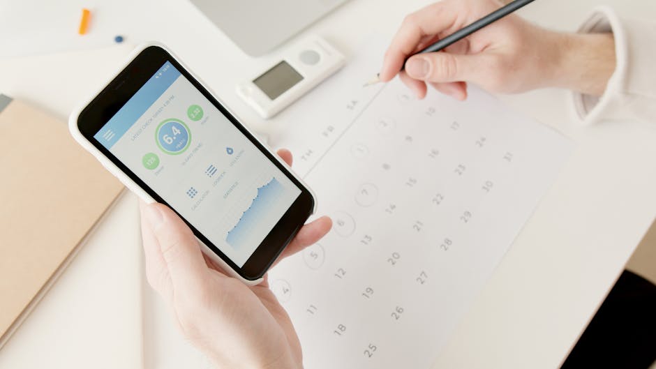
1. Composed
Composed earns the top spot on this list because it makes the most common planning friction — the act of adding something — essentially disappear.
Most planner apps require you to stop what you’re doing, open the app, navigate to the right date, tap through a series of fields, and then save. That’s fine once. It’s exhausting as a daily habit.
Composed lets you speak instead. You say something like “Haircut Thursday at 2, leave by 1:30” and it creates the event, sets the departure time, and generates a short prep checklist automatically. The whole thing takes about ten seconds.
The quietest kind of productivity is the kind that doesn’t feel like productivity at all. You just said a sentence and your day got a little more organized.
The visual design is calm and warm — no aggressive reds or rows of not yet done labels screaming at you. The reminder style is intentional too: graduated and friendly rather than jarring. If you’ve ever been startled by a notification that felt more like a scolding than a helpful nudge, Composed is the antidote.
It’s iOS only, which is worth knowing. But if you live in the Apple ecosystem, it fits naturally into your existing setup.
Download Composed on the App Store
2. Things 3
Things 3 by Cultured Code has been the gold standard of beautiful, simple task design on iOS for years, and it still holds up in 2026.
What makes Things minimalist isn’t a lack of features — it has quite a few — but rather how those features are hidden until you need them. On the surface, you see clean lists with gentle typography. Dig deeper and there’s project support, tags, and scheduled reviews. But none of it crowds the main view.
The tradeoff: Things is a task manager at heart, not a calendar. If you want to see your day laid out with time blocks and events alongside your things to do, you’ll need to work around that. For people whose planning is primarily list-based, though, it’s an excellent choice.
3. Structured
Structured takes a visual day-planning approach — it shows your day as a timeline, and you slot things into it. The aesthetic is clean and calm, the interactions feel considered, and the timeline view is genuinely useful for people who think in sequences rather than lists.
It works especially well if you have a mix of calendar events and things to do and want to see them in one place. The visual metaphor helps with something most apps ignore: time blindness. Understanding time blindness is key to designing a planning system that works with your brain, and Structured’s timeline does more to address it than most apps twice its complexity.
The minimalism here is more visual than philosophical — there are settings and options — but the default experience is genuinely calm.
4. Clearlist
Clearlist is exactly what it sounds like. A list. You add things, you check them off, they disappear.
No projects, no tags, no calendar sync, no reminders that carry over. Every day starts fresh. This is either a feature or a limitation depending on your personality, but for a certain kind of person — especially those who find persistent, growing lists demoralizing — Clearlist is the most peaceful app on this list.
It won’t work if you need to track multi-step commitments or coordinate with others. But for day-to-day capture and a sense of daily completion, it’s remarkably good at the one thing it does.
5. Fantastical (Minimal Setup)
Fantastical is a full-featured calendar app, which might seem like an odd inclusion on a minimalist list. But hear this out.
Fantastical earns a mention because its natural language input genuinely reduces friction. You type “Dentist Monday 10am” and it parses the event without making you tap through date pickers and time selectors. For people who want a proper calendar — one that syncs everywhere, shows all their events, and integrates with other tools — but want to add events with minimal effort, Fantastical is worth considering.
The key is keeping the setup minimal. Turn off the features you don’t need. Start with one calendar. Resist the urge to enable every integration. Fantastical at 20% complexity is a different, calmer app than Fantastical at 100%.
How to Actually Choose
Reading a list like this and then spending two hours trying every app is its own productivity trap. Here’s a cleaner way to decide.
Think about where your planning friction actually lives.
Is the problem that you forget to add things at all? Voice input apps like Composed solve that better than anything else. Is the problem that you add things but never do them? That’s often a list-organization issue — Things 3 or Clearlist might help. Is the problem that you can’t visualize your day clearly? Structured’s timeline view is worth trying.
The wrong move is assuming that more features will fix a system problem. If you’ve ever abandoned a planner, it usually wasn’t because the app had too few features.
Start with the lowest-friction option.
There’s a reason minimalist apps have an almost cult-like following among people who’ve tried everything else: they work because they don’t require much from you. A perfect system you ignore beats a simple system you actually use — except it doesn’t, because you won’t use it. The simple one wins.
Give it more than three days.
Any new planning habit feels awkward at first. The first few days with any app are the worst possible time to evaluate it. If you’re going to test something, commit to a week at minimum and actually put a few real things in it.
A Note on Minimalism and Features
There’s a version of minimalism that’s just aesthetic — white backgrounds, thin fonts, satisfying animations. That’s fine. But the kind of minimalism that actually changes your life is structural.
A structurally minimalist app makes decisions for you that you’d otherwise have to make yourself. It doesn’t ask you to categorize everything. It doesn’t surface things you have no control over. It doesn’t make you feel the weight of everything you haven’t done yet.
The minimalist approach to digital planning isn’t really about having fewer apps or emptier screens. It’s about reducing the number of decisions standing between you and a calmer day.
The apps on this list do that in different ways. Some strip features away. Some use design to hide complexity. Some use smart defaults to eliminate choices entirely. All of them take the position that your mental energy is worth protecting.
Quick Comparison
| App | Best For | Calendar Sync | Voice Input | Free Option |
|---|---|---|---|---|
| Composed | Effortless capture + prep | Yes (read) | Yes | Free tier |
| Things 3 | Beautiful list management | Yes | No | Paid upfront |
| Structured | Visual day timeline | Yes | No | Free tier |
| Clearlist | Daily fresh-start lists | No | No | Free |
| Fantastical | Full calendar, low-friction input | Yes | No | Free tier |
The Honest Bottom Line
No app is going to fix a system that doesn’t match how you actually live. The best planner app for you is the one that makes showing up for your own life a little easier — not the one with the most features, the most integrations, or the prettiest screenshots.
Most people who struggle with planning aren’t disorganized. They’re using tools designed for someone else’s brain. The minimalist category exists precisely because a lot of people figured this out and started building something better.
The clearest advice: match the app to where your friction actually lives. If you forget to add things, lower the capture barrier. If you add things but never act on them, simplify your lists. If you can’t see your day clearly, try a timeline view. No single app solves all three — and trying to find one that does is usually how you end up back at square one by Wednesday.